|
Design Principles:
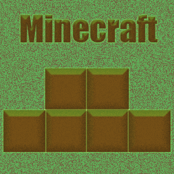
Contrast: There is good contrast with the two colors. The brown gives the page a dull look, whereas the green gives a vibrant look to the image Repetition: I repeated the boxes in the image. Alignment: Only the boxes are aligned. Proximity: The text and the boxes are not by each other but the boxes are right next to each other since they are the same. Color: I used a brighter green with a darker brown. These colors match what would be seen when playing the game Minecraft Font: The title font is partially constructed with blocks. The game Minecraft uses blocks so I wanted to find a block like font. Layout: I put the text above to give attention to what the image is all about and I put blocks below to emphasis what the game is and help anyone else get familiar with the game. Photoshop Tools used
|
|
