|
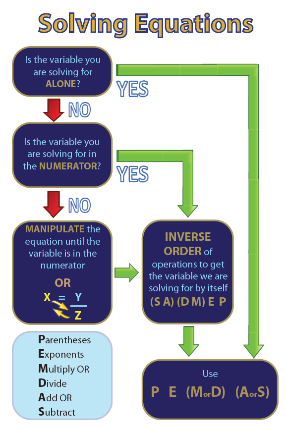
This image was created to help our student have a step-by-step process for manipulating and solving an equation. We found as a department that many students struggled with this concept. We created this to address their issues in hopes to get students to better get past the algebra problems that they face.
Design Principles: Contrast: We used a lot of lights and darks in this image. The text is light in the background for the majority of the bubbles. The key words also contrast inside the and are all caps to help students remember the point of each step without having to read the entire section. The YES and NO correspond to green and red. There is one bubble that is not part of the flow, and that bubble is opposite the rest, light background and dark text color. Repetition: The same bubble style is used throughout. Sizes vary so that the text can fit appropriately. The arrow sizes are the same. Alignment: There is a strong left alignment with the bubbles. The arrows and bubbles are aligned. The bubbles in the middle are left-aligned with each other. Proximity: There is enough space between each of the sections to see each portion's importance to the entire display. The YES and NO are right next to the arrows they represent. Color: The colors for the arrows match the answer to the question. The background for the bubbles is blue to be easier on the eyes. Font: The font style is Myriad Pro. This sans-serif font is easy to read. The purpose of this font is to help students learn the process and not get bogged down trying to read. Layout: Most of the information is aligned with the left side. Naturally you work your way from the top-left corner to the bottom right corner. The intent is that you always start at the same spot and end at the same spot. |
