|
Design Principles:
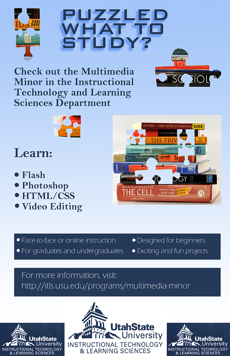
Contrast: The biggest contrast in this image is the dark blue with the light blue. It switches between the two for the text and background. The title has some additional contrast with the shadow, whereas the rest of the text does not. The picture has colors other than blue, which contrasts with the rest of the image. Repetition: The font styles for the items on the main section as well as for the items in the rectangles are repeated. All of the bullet points throughout the image are the same. There are multiple puzzle pieces in the image. Alignment: The left side has a strong alignment, where the puzzle piece, the paragraph, the bullet points and the bottom rectangles are all aligned. Proximity: There is space between each of the sections. When there are similar items, they are together. The puzzle pieces are close to each other. Color: Blues are used for the font color and background color. This matches the Utah State University colors. Font: The title font is partially constructed with blocks, similar to a puzzle piece. The other fonts are easier to read so that the viewer can know what action to take. Layout: Most of the information is aligned with the left side. It is easier to work your way down the page. The puzzle pieces are close to the image they belong, but dispersed throughout the text to naturally break it up. Photoshop Tools used
* image obtained from http://www.gijobs.com/top-5-websites-find-textbooks-less/ |
